
We have implemented the poster design and sign design plans for the 22nd Annual Conference of the Japan Society for Disability Studies (conference chair: Professor Koichiro Fukada), which was held at the Sakado Campus of Kagawa Nutrition University.
Acknowledgment: We would like to express our sincere gratitude to conference chair Professor Koichiro Fukada for his generous cooperation with the poster and signage designs, despite his busy schedule. We would also like to express our sincere gratitude to the members of the Welfare Sociology Laboratory at Kagawa Nutrition University for their generous support with the signs installation.
The 22nd Annual Conference of the Japanese Society for Disability Studies Dates: September 20th – 21st, 2025
Design of details
◼︎Poster
Main visual:When I attended the Japan Society for Disability Studies conference for the first time, I was deeply impressed by the culture of the society, where all the participating members listened attentively to each free report, and where people with disabilities, those working in the field, and researchers all considered the issue seriously from the same perspective, exchanging opinions and discussing them with each other.
There was no pretense or falsehood there, and the space felt very rich.
I tried to express the image I felt at that time, and the way the brilliant perspectives and questions of the Japan Society for Disability Studies are gradually being integrated into society from this society. We created 10 different visuals by combining colors and shapes, and asked the members of the conference organizing committee to select one of them, which was adopted.
Information layout:
The events are divided by the date of the event, and the information is laid out chronologically from top to bottom, connected by lines to make it easier for the eye to move. By reversing some of the images, contrast is added to the surface of the poster, preventing the information from appearing scattered.
Colors that indicate information: The university colors of Kagawa University are used for text, QR codes, etc.
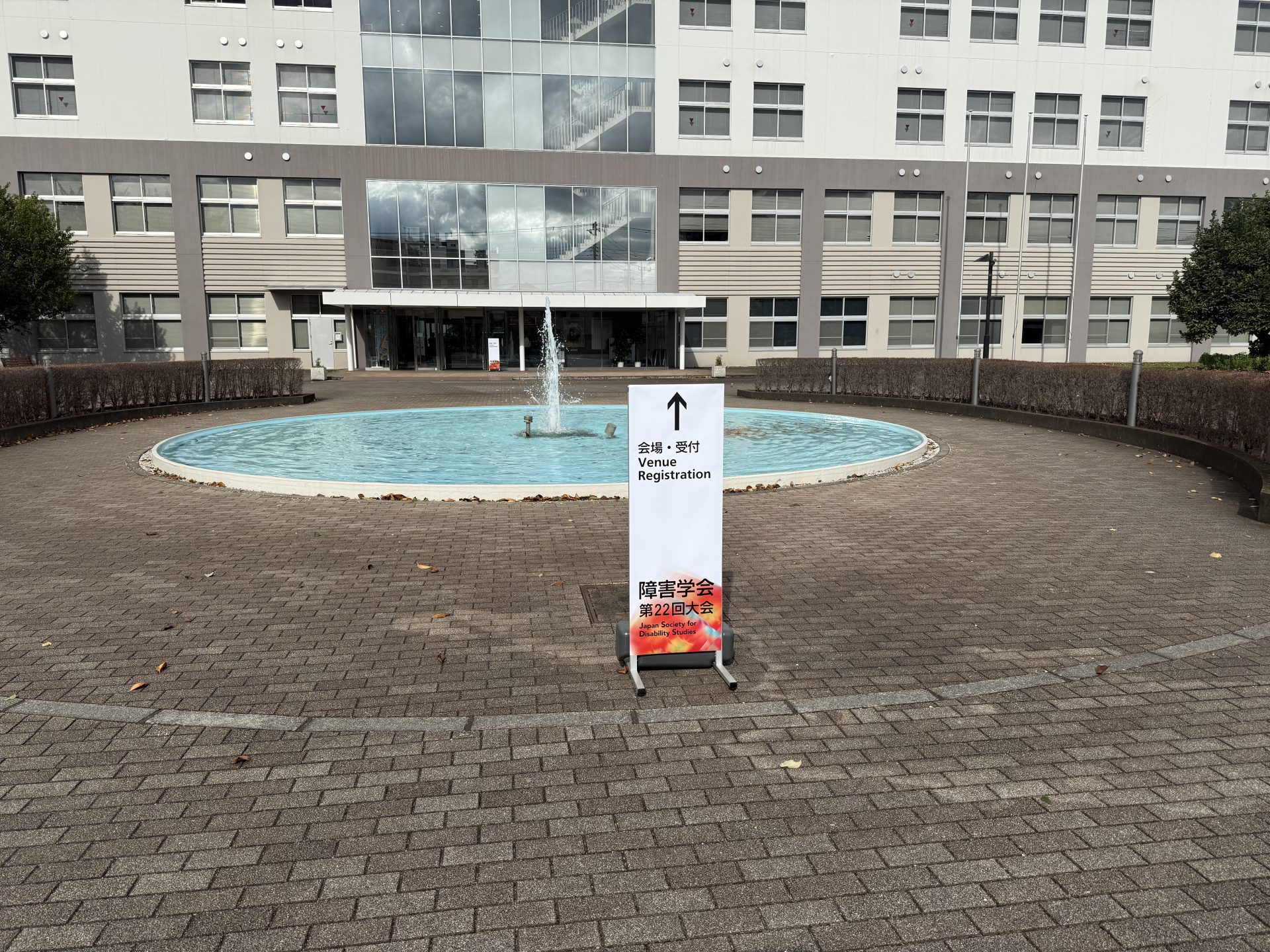
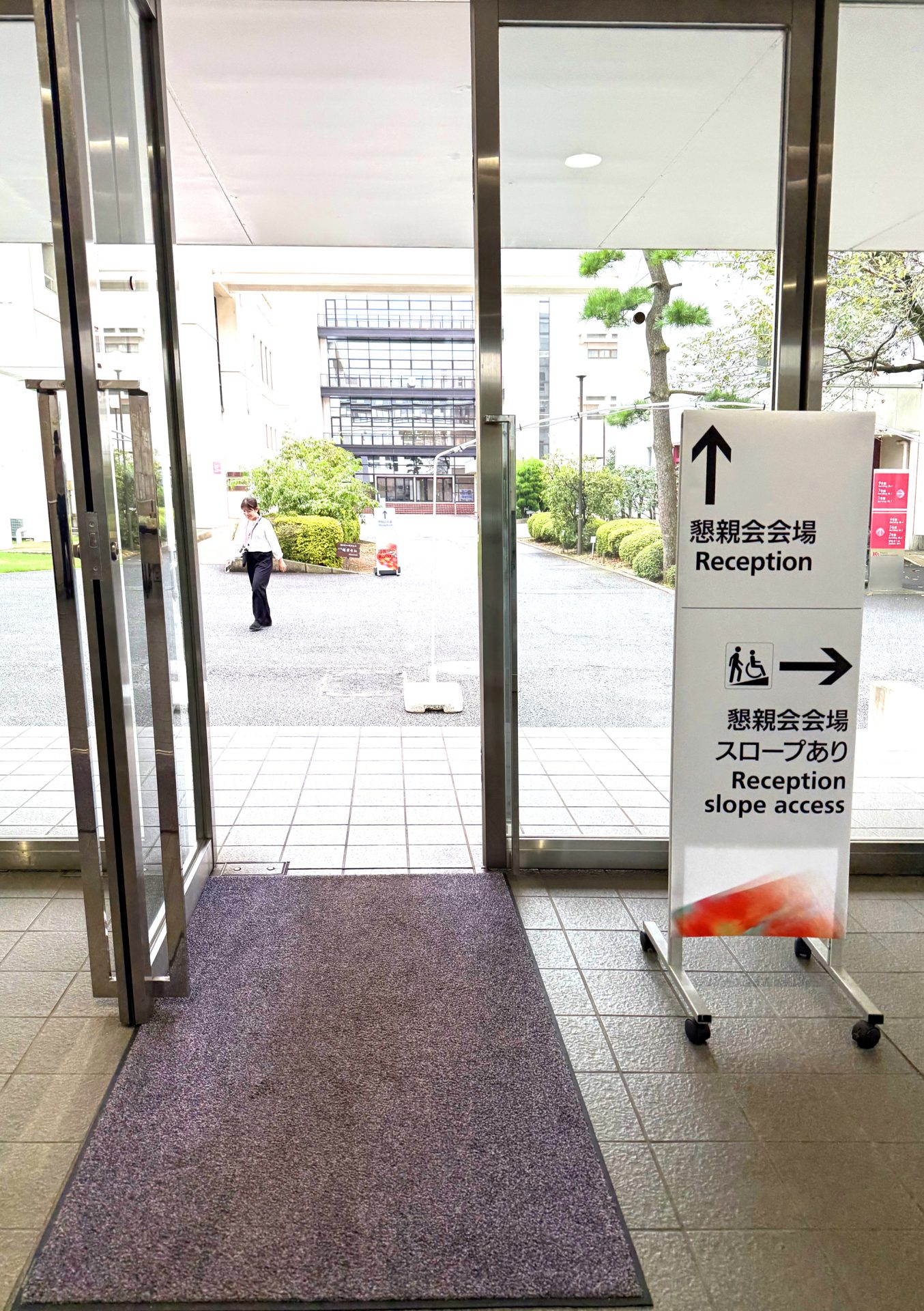
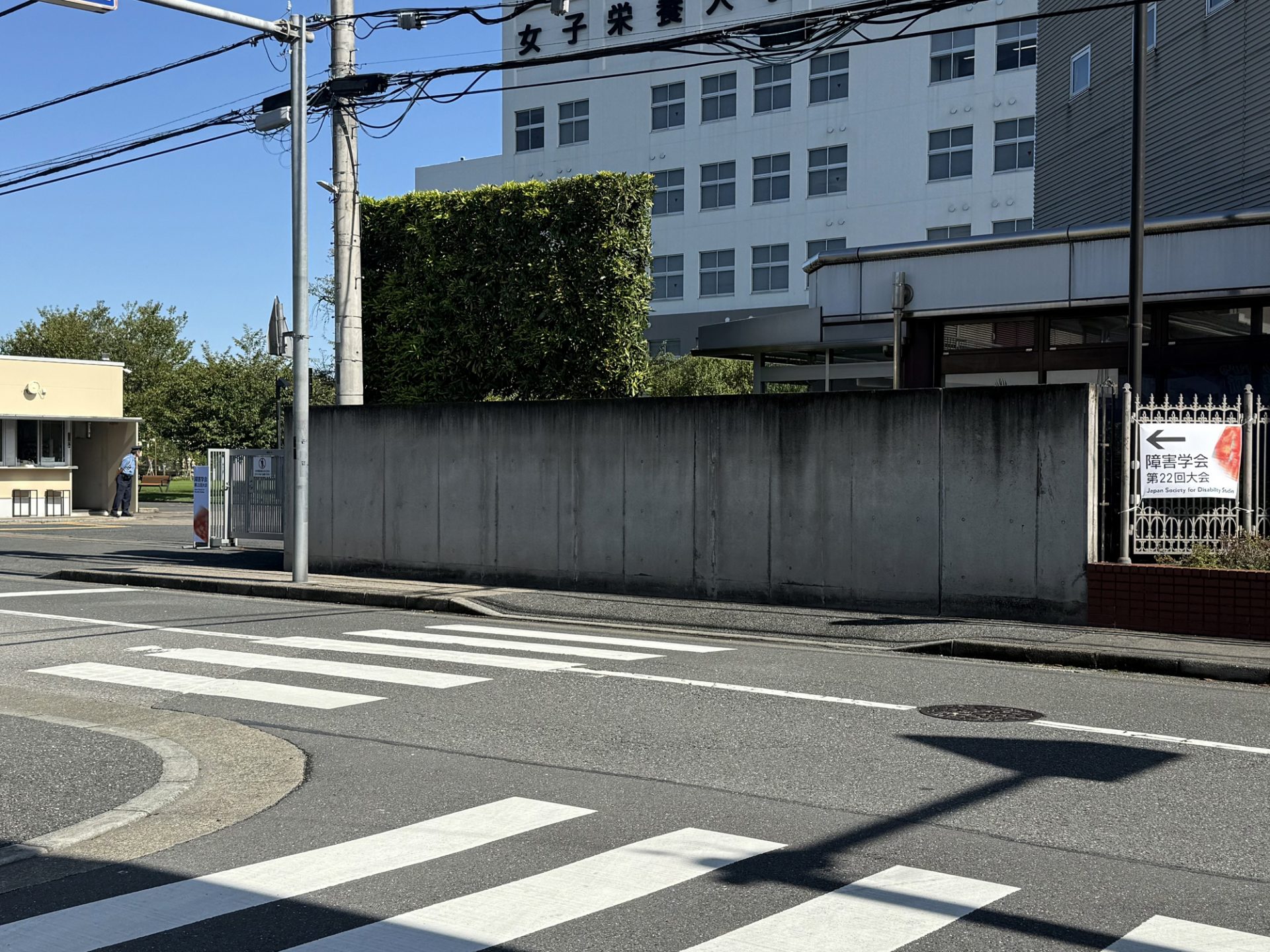
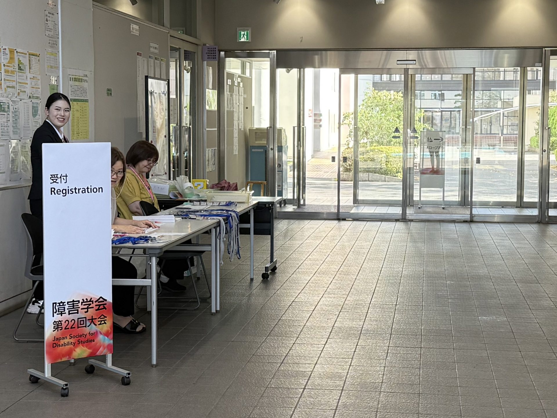
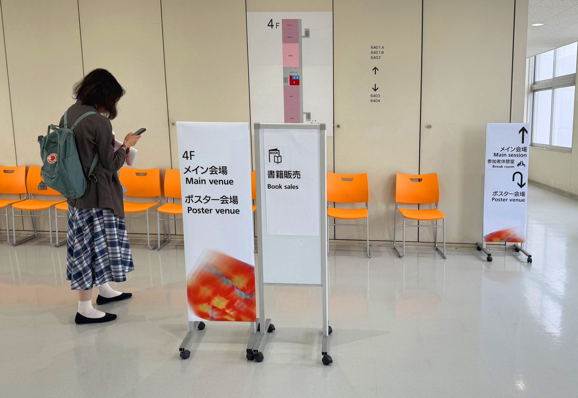
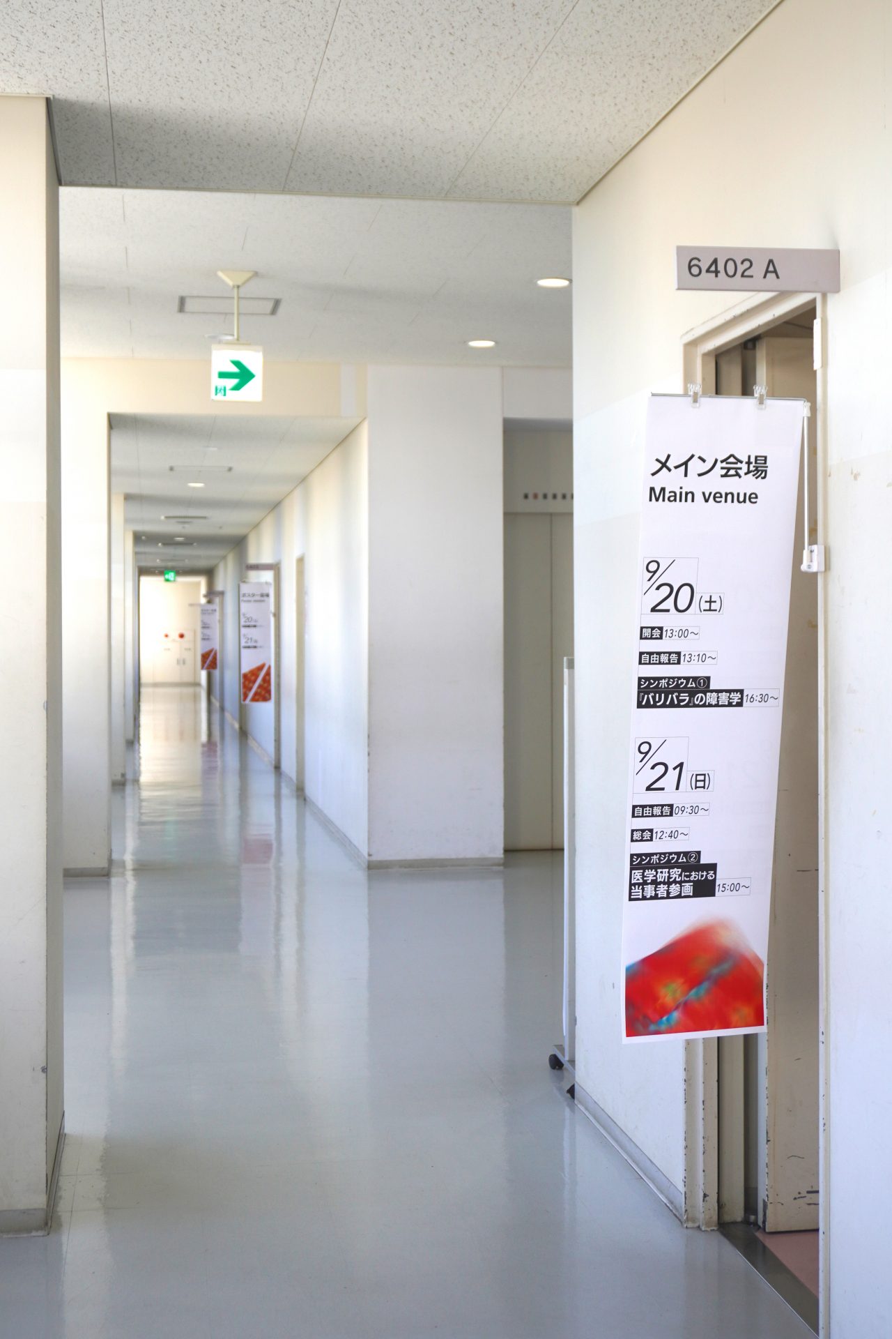
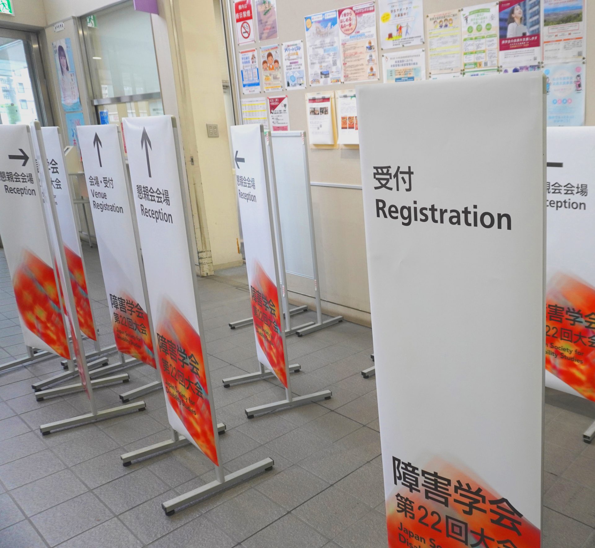
◼︎Sign design planning
Field of view and font: The text information on the sign is placed within the field of view, making it easy to see for wheelchair users and those in a forward-leaning position. Highly readable fonts have been selected for both English and Japanese characters, and kerning has been applied appropriately.
Information colours: To make the information easy for visitors to see both indoors and outdoors, the letters, arrows, and pictograms showing the information on the signs are colored black N1.0 (C0, M0, Y0, K100) to create contrast with the white background color.
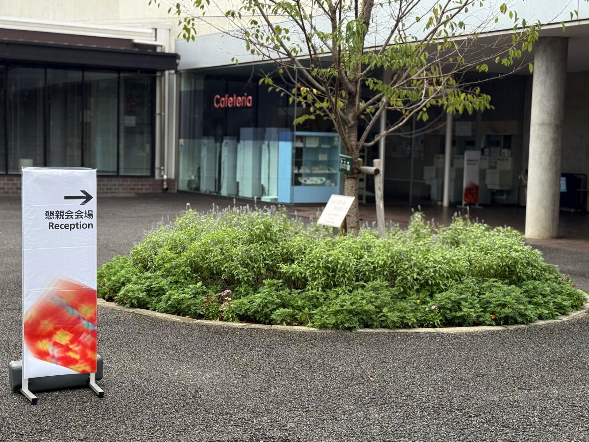
Applying the main visual: By using the same main visual as the poster, it is more eye-catching than text information alone. Also, by being repeated in the space, it is easy to identify that it is a “sign for the Japan Society for Disability Studies Conference,” which helps to put visitors at ease when they are visiting the venue for the first time.
Pictogram: For content with commonly used shapes, standard pictograms were used. This time, appropriate shapes were selected from ISO (International Organization for Standardization), SIS (Swedish Institute for Standards), and JIS (Japanese Industrial Standards) pictograms and applied to the signs.
◼︎Design Collaborating Students
Poster Design: Kyushu University, School of Design, Media Design Course, B4, Itaru Tsuguchi
Sign Design Planning: Kyushu University, Graduate School of Design, Doctoral program course, D2, Chisato Kaneko