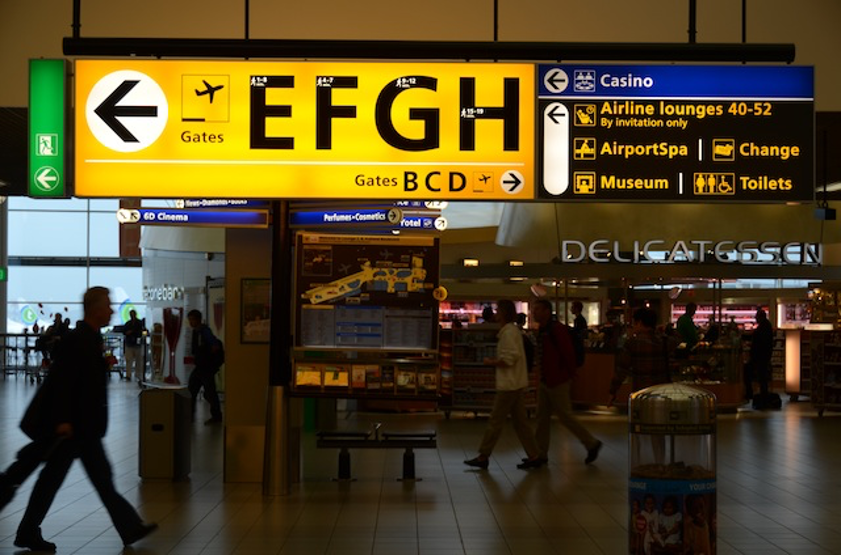
Autumn 2012: Schiphol International Airport (Photo by Kudo, and so on)
In 2012, having received a JSPS DC2 grant of “Sign design planning in Educational Facilities: Focusing on Cognitive Characteristics of Form and Color by type of disabilities”, I visited the Netherlands for the first time to investigate the current state of visual support and Sign design for children with disabilities in inclusive schools and special needs schools there.
It was then that I unexpectedly came across the Sign design at Schiphol International Airport and for the Netherlands Railways, designed by Emeritus Prof. Paul Mijksenaar of Delft University of Technology.
I was captivated by the Signs, which were surprisingly clear, easy to understand and appealing, and as soon as I arrived, I found my self snapping away. The Signs are incredibly easy to read. I was truly puzzled as to why it was so easy to read.
Keeping “standard”in mind, the pictograms were designed to incorporate human figures, actions and motion lines, designed for spaces such as museum and children’s play area.
As a PhD student in the midst of researching pictograms that would be easily understood by people with intellectual disabilities, these graphic design felt like a boost of encouragement. I felt a sense of certainly about my hypothesis.
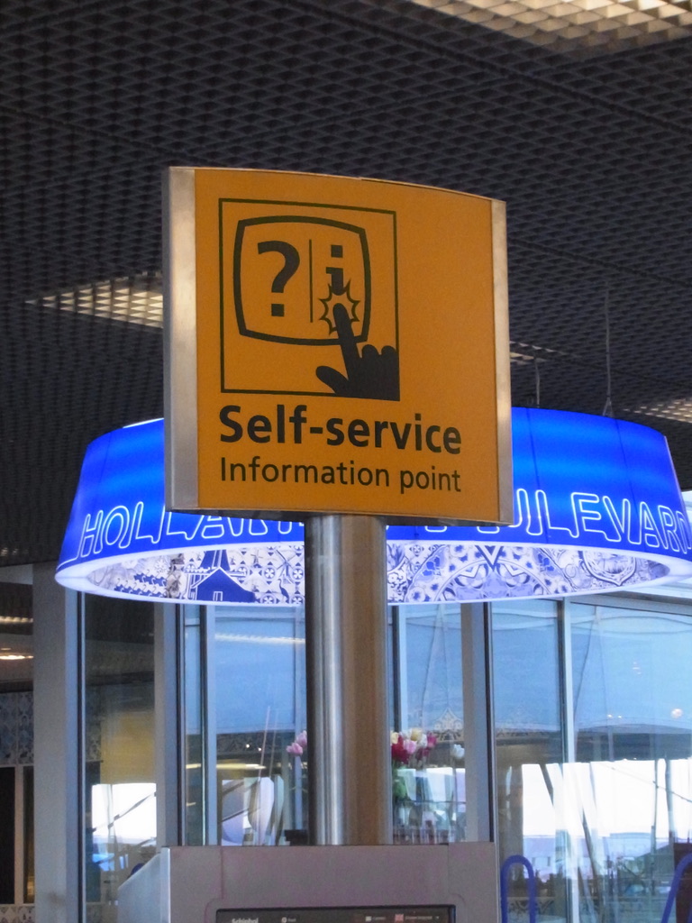
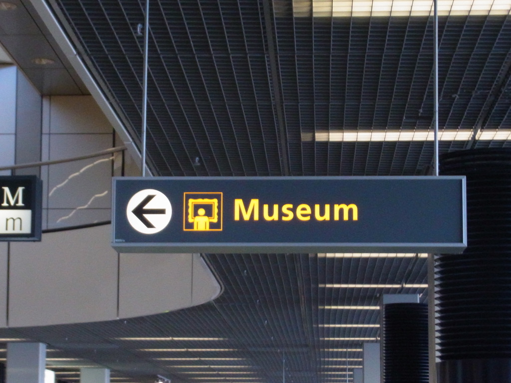
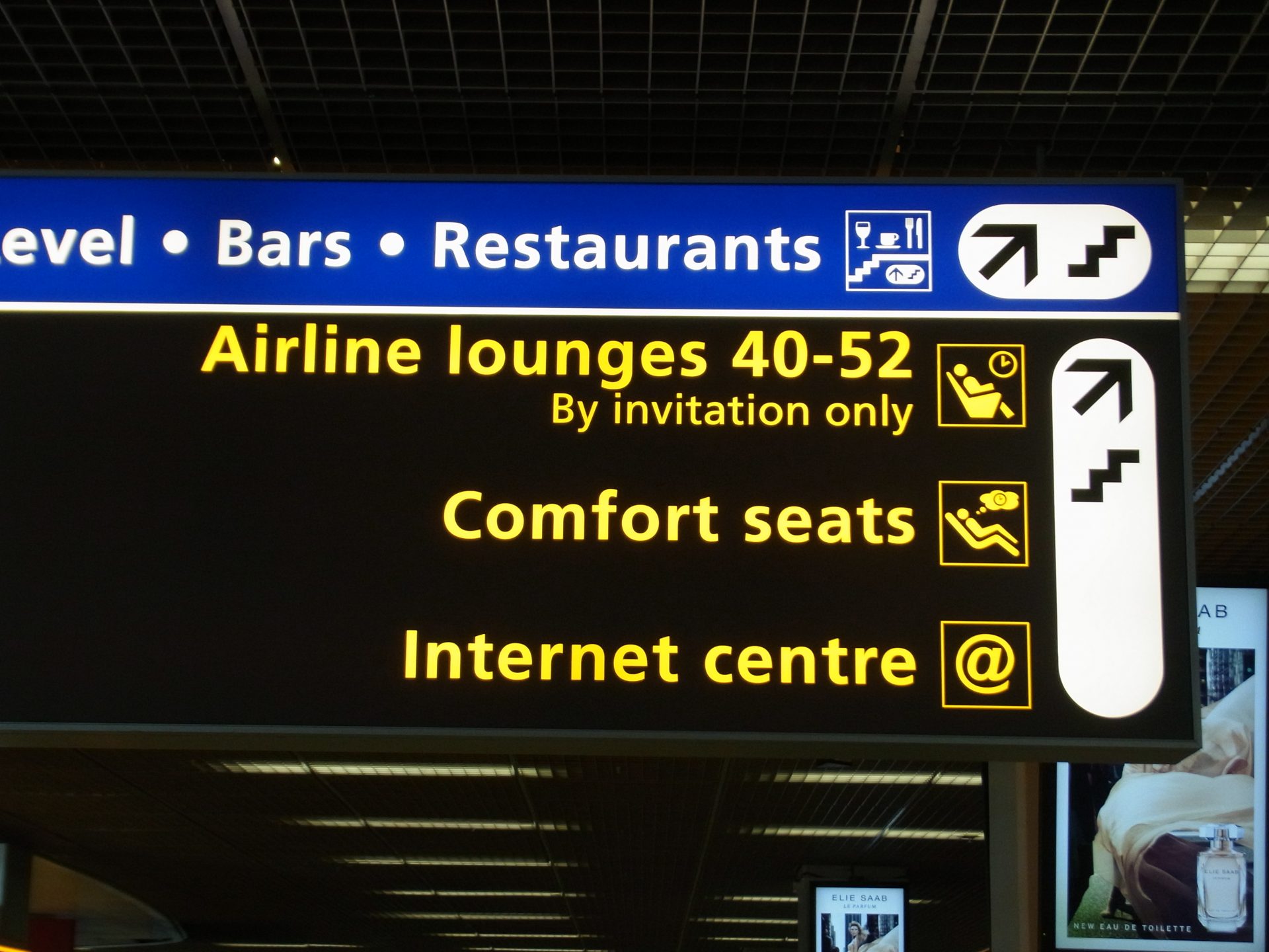
When I was a PhD student, I spent the Netherlands in autumn, a season when the mornings were dark and cold. Yet even in the early hours of the morning, when it was still dark and chilly, the Dutch railway signs—despite being blue—did not give off a cold impression; rather, much like Delftware, they conveyed the information clearly whilst still feeling warm and welcoming.

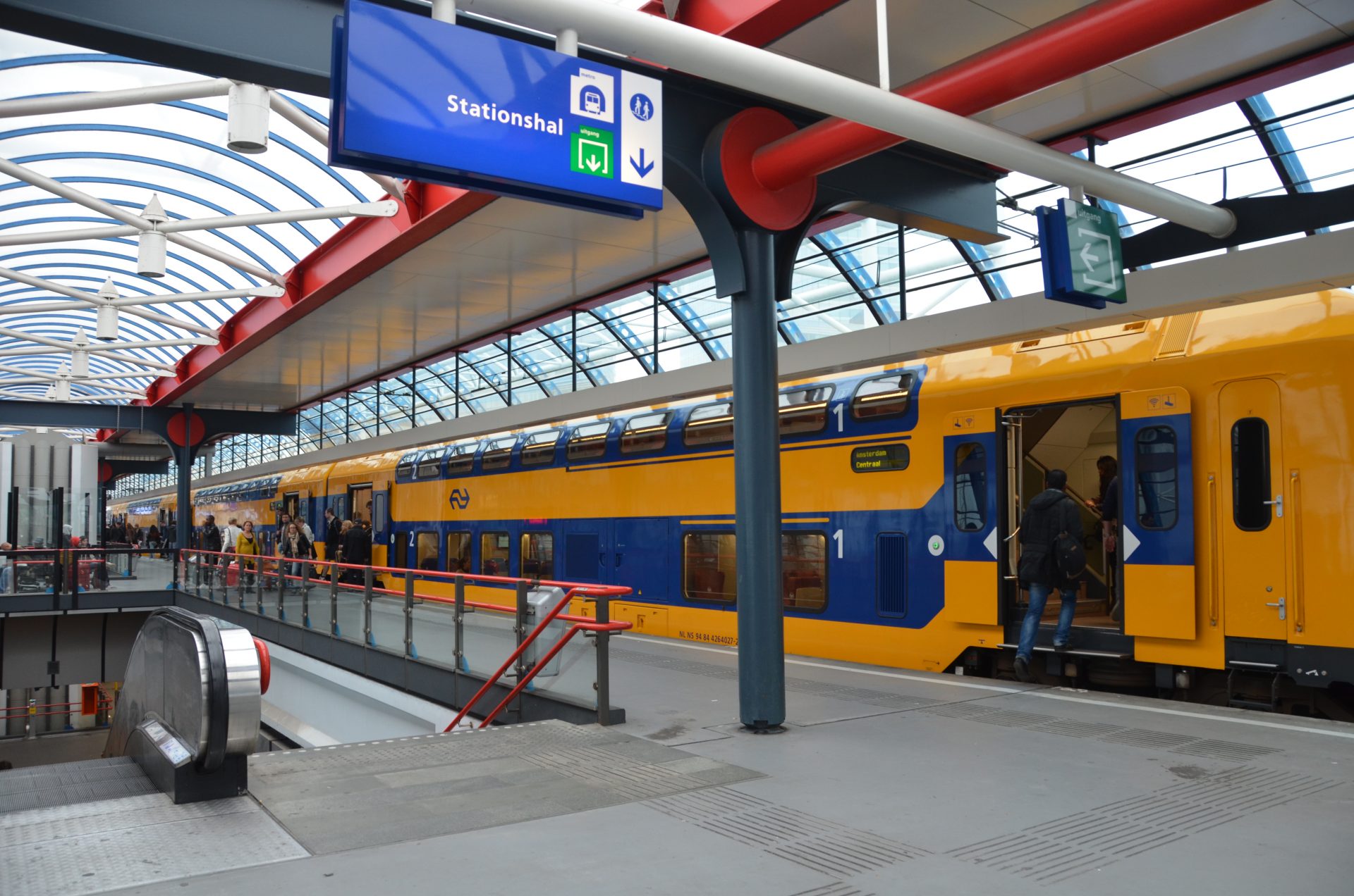
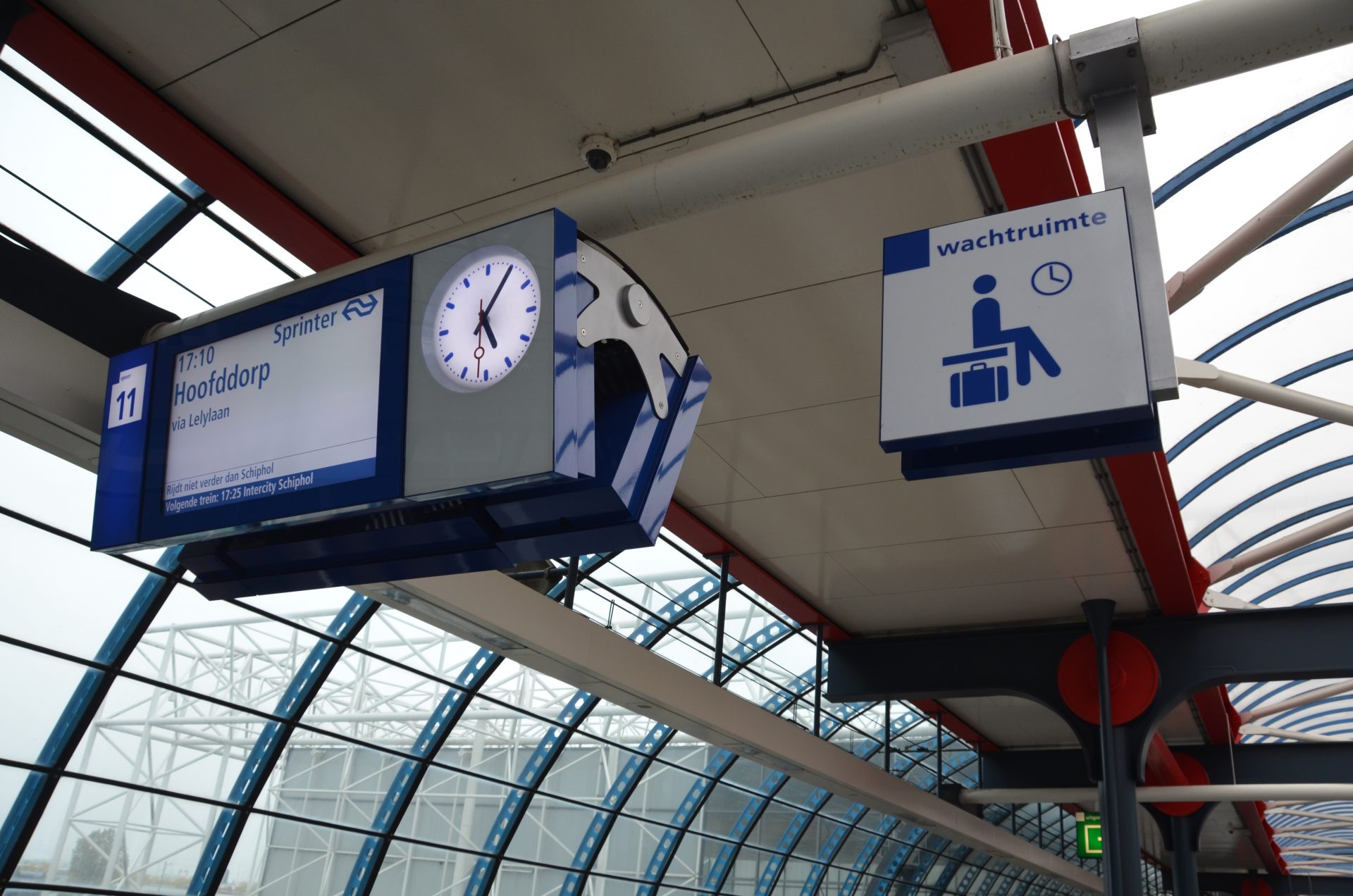
Autumn 2012
In May 2026, after 14 years, I had the opportunity to meet Emeritus Prof. Paul Mijksenaar, who was able to answer questions that had long puzzled me. It was Mr Keiichi Koyama, managing Director of i Design and Chair of ISO TC145 SC1 Japan mirror committe, who introduced me to Prof. Mijksenaar. Mr Koyama and Prof. Mijksenaar are long-standing friends. I would like to express my heartfelt gratitude to Mr Koyama for bringing us together.
Emeritus Prof. Paul Mijksenaar explained the sign manual for Schiphol International Airport to us. Whilst legibility is one of its greatest strengths, I learnt that this was achieved through extensive testing of kerning and weight adjustments. No matter how much testing is carried out, the final decision on which option to choose ultimately rests with the designer; this is a testament to his skill.
◾️For further details, Emeritus Prof. Paul Mijksenaar
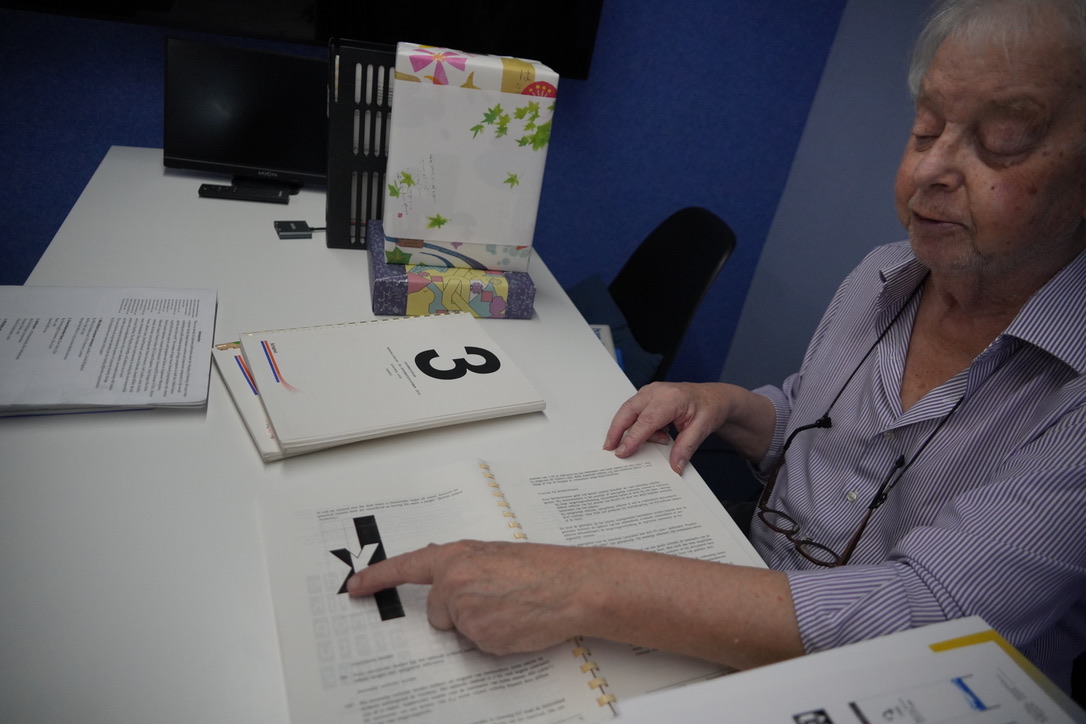
In addition to his extensive practical work, he had also collected and studied a vast amount of reference material. Among these, I was given the opportunity to read a book I had long wanted to read but could no longer obtain: Jock Kinneir’s Traffic Signs 1963: Report of the Traffic Signs Committee.
◾️For further details, Jock Kinneir
Listening to him talk about the books and stories he hold dear, I sensed a deep interest in and respect for the history of design and the psychology of visual perception. He also spoke of the respect me has for Harm J. Zwaga, whom I greatly respect.
MIJKSENAAR office, the practice of Emeritus Prof. Paul Mijksenaar, is engaged in innovative research and practice in the field of sign design; one of the aims of this visit was to observe the current state of its implementation in the Netherlands and to gather detailed insights.
The first of these concerns the white paper ‘Beyond the Binary – Setting the wayfinding standard for inclusive restrooms’, published in 2021. The report states that it is preferable to label toilets according to their function rather than by gender. Furthermore, it highlighted not only the need to change the design of pictograms but also the importance of education and communication.
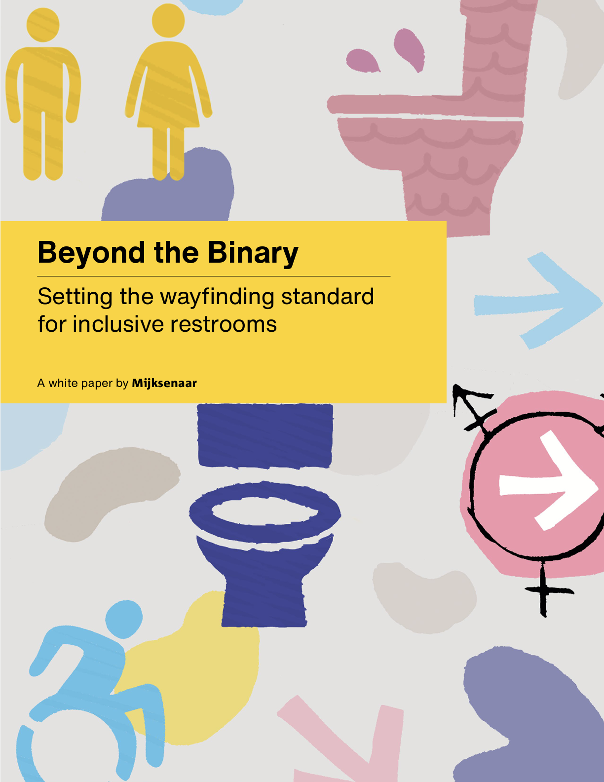
◾️For further details, see the report MIJKSENAAR office ‘Design for All’
During my recent visit to Amsterdam, I noticed that zoos and museums were using pictograms of toilets and urinals rather than traditional male and female figures, reflecting an inclusive approach to toilet facilities. It appeared that these facilities were being implemented with careful consideration of the target visitors and the specific venue.
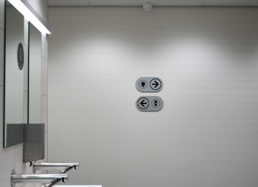
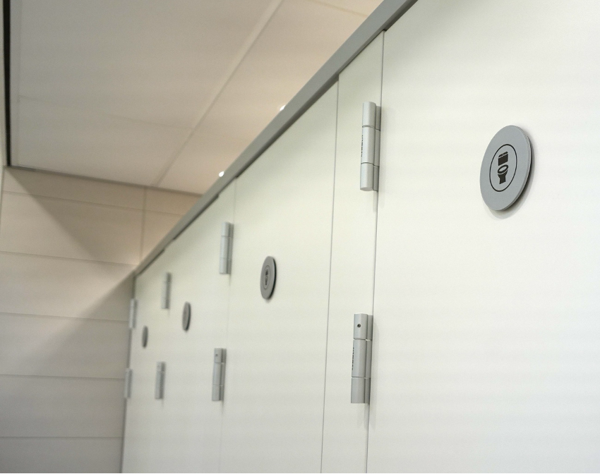
Toilets at ARTIS Royal Zoo Amsterdam: Pictograms for urinals and toilets
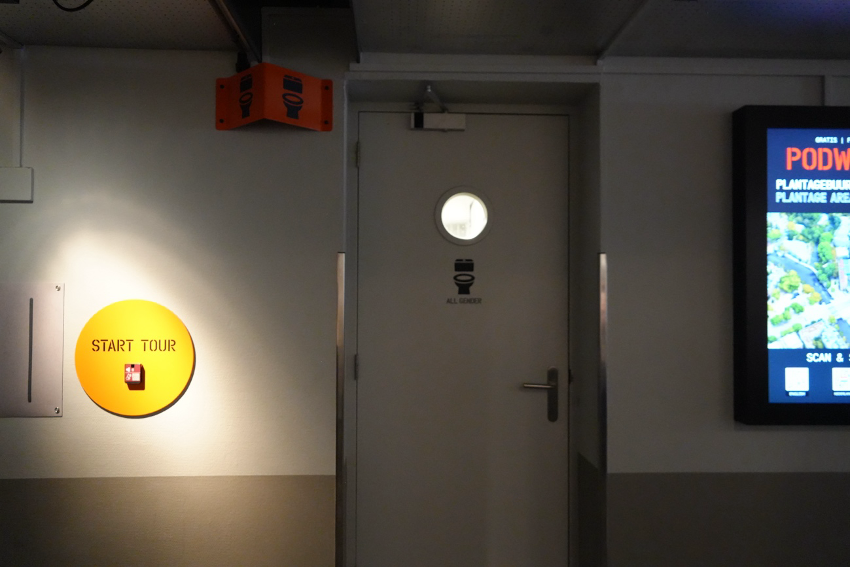
Toilets at the Resistance Museum: The words ‘ALL GENDER’ are highlighted alongside the toilet pictogram
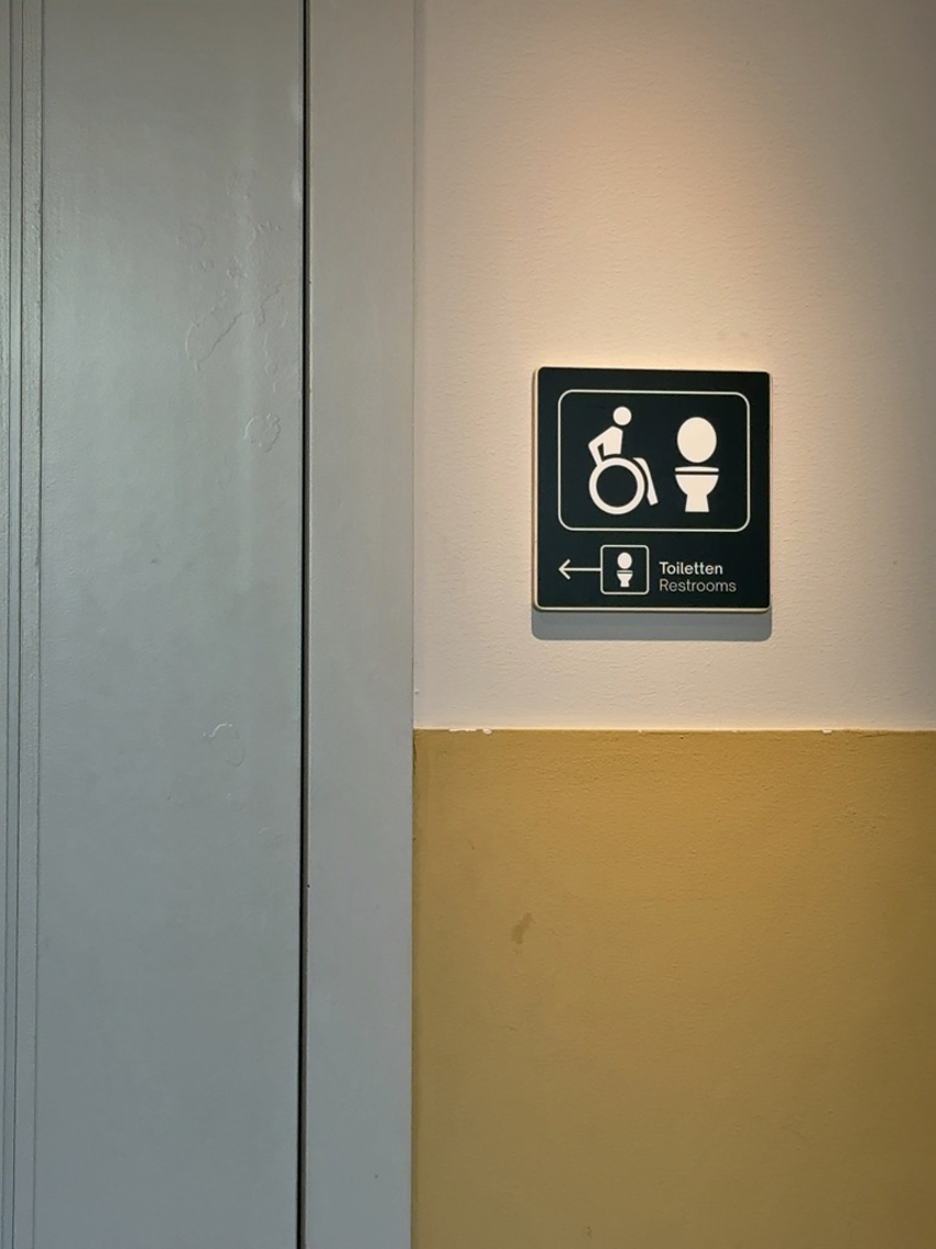
Toilets at the National Holocaust Museum: Pictograms for wheelchair users and toilet seats
The second point concerns a metro signage research project commissioned by the Amsterdam Transport Authority, and led by M.S. Fenne Roefs, who specialises in cognitive psychology and information design.
Ms Fenne Roefs is a graphic designer and researcher who has held my interest, as she, like me, has been conducting research into graphic design targeted to people with intellectual disabilities. Thanks to Emeritus Prof. Paul Mijksenaar, I had opportunity to meet her on this time.
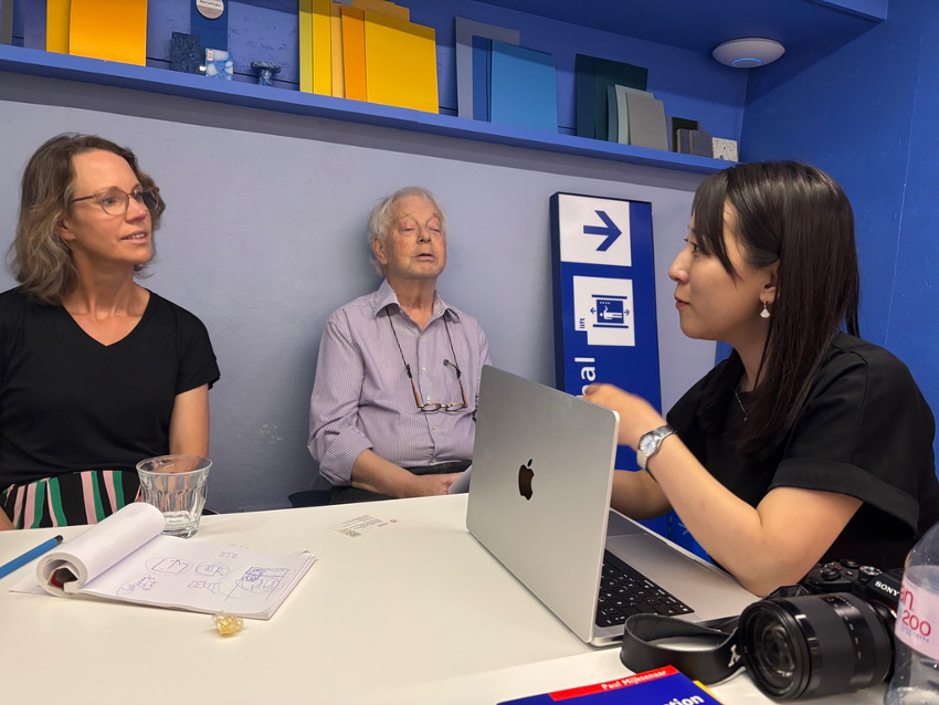
Left: Ms Fenne Roefs; Centre: Emeritus Prof. Paul Mijksenaar; Right: Kudo
The findings reflect the results of a survey on the preference of sign design notation: text-only, pictogram-only, text and pictograms, targeting three groups: people with mild intellectual disabilities, those with low literacy, and non-Dutch speakers.

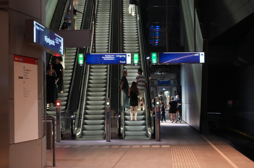
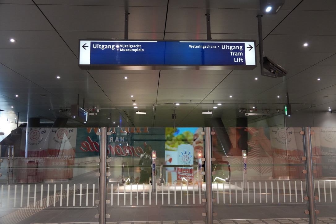
Amsterdam Metro, Vijzelgracht Station
◾️For more details,see the report from MIJKSENAAR office Lab
In the case of the Amsterdam Metro, based on the outcomes of these three studies, and based on other constraints, like sign size and number of destinations, they concluded that adding a limited number of pictograms and the English term “Exit” would increase the comprehensibility of the signs for certain user groups.
She stated, “The results clearly showed that conducting a study, even on a limited scale, can assist designers and clients in their decision-making processes. Whilst the findings of this study cannot be generalised to other underground signage systems, they do underscore the importance of conducting field research.”
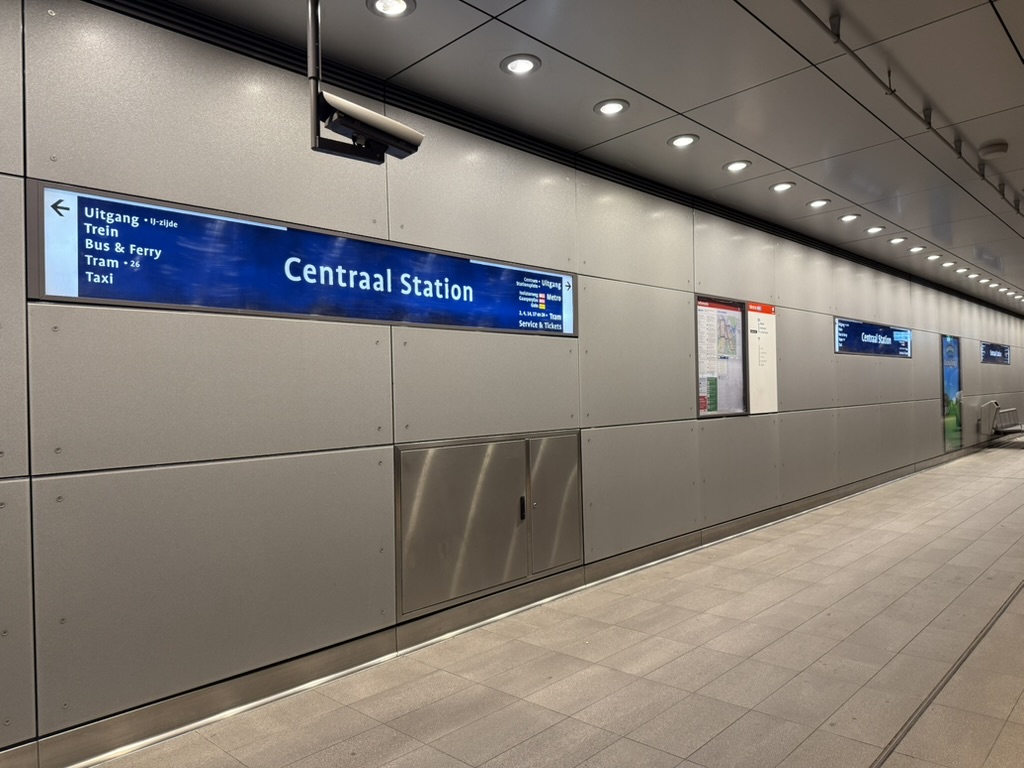
It was clear that great care had been taken with the layout when presenting the information on the sign using text alone. The white arrow-shaped symbol—which appears as if a flag grouping the text and arrow direction has been tilted by 90 degrees—was particularly striking, and I found it very easy to understand when viewed in person.
Ms Fenne Roefs also shared details of an initiative involving beach flags and pictograms designed to highlight dangers at the seaside. As this relates to the research being conducted by students in the Kudo Laboratory on young children’s understanding of pictograms, it was extremely interesting.
◾️For more details, see the report from MIJKSENAAR office Lab
In addition to the above, I received a great deal of valuable guidance and a warm welcome.
I would like to express my heartfelt gratitude to Emeritus Prof. Paul Mijksenaar, Ms Fenne Roefs and everyone at MIJKSENAAR for taking the time out of their busy schedules to provide us with such detailed explanations, as well as to Mr Keiichi Koyama, managing Director of i Design and Chair of ISO TC145 SC1 Japan mirror committe, for facilitating this opportunity.
**************
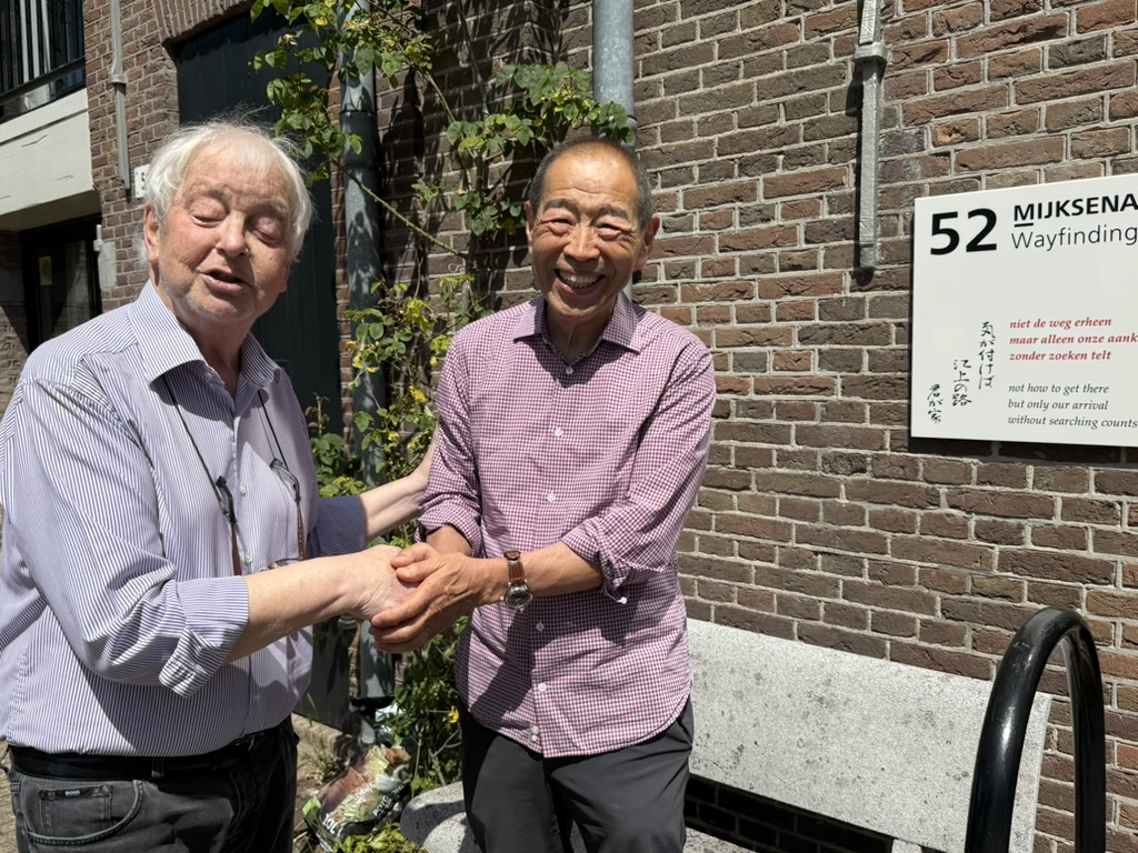
Prof. Paul Mijksenaar and Mr Keiichi Koyama: To digress slightly, the haiku composed by Prof. Mijksenaar (capturing the essence of wayfinding) was translated into Japanese by Mr Koyama and his wife. On the day of our visit, we were treated to the surprise of seeing it unveiled as the sign for the MIJKSENAAR office!
It truly felt like a testament to the friendship between the two of them, and between the Netherlands and Japan.
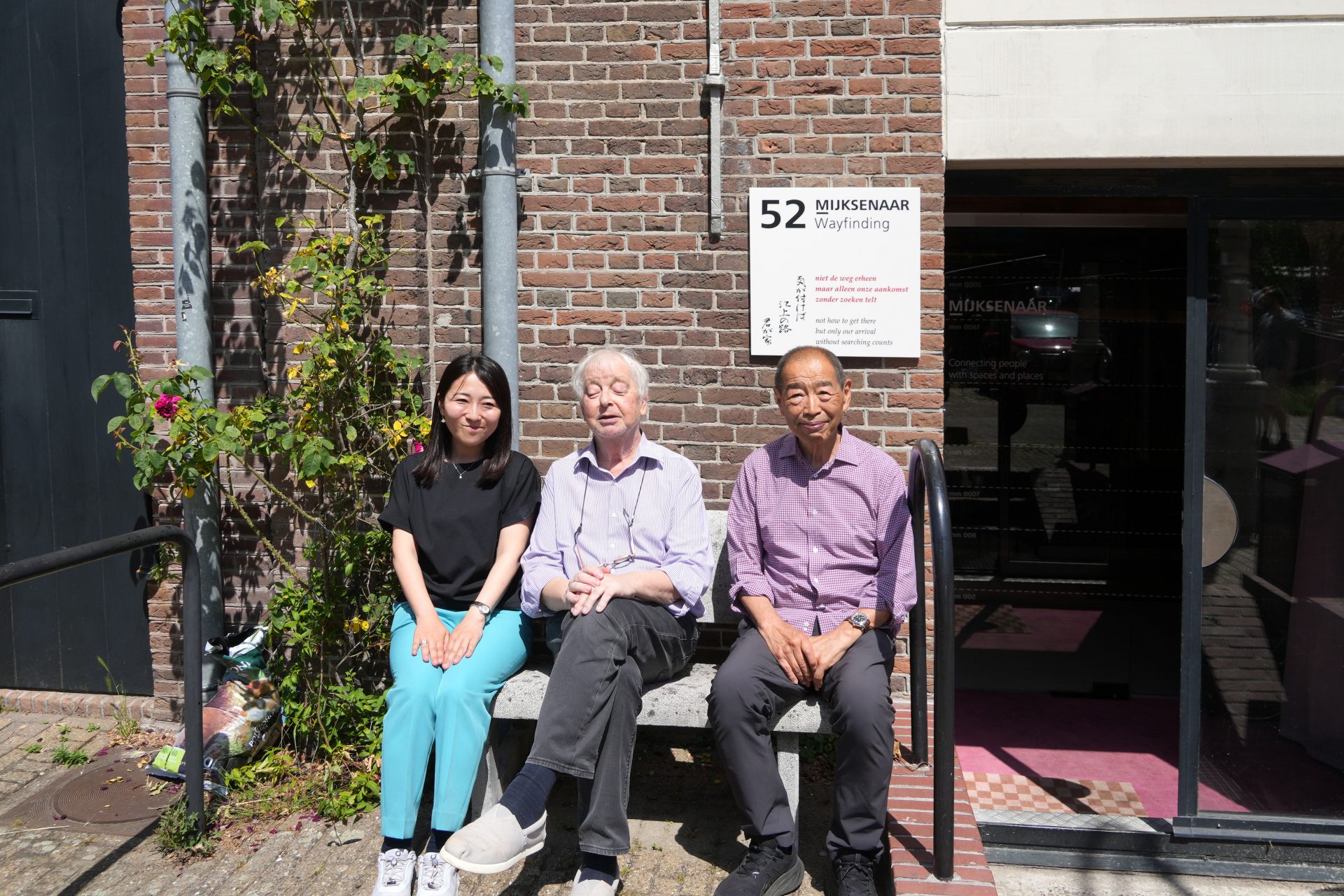
A group photo in front of the MIJKSENAAR office: It was a lovely, sunny day
*This research was conducted with funding from the Scientific Research Grant-in-Aid for Scientific Research (B) project “Development of Sign Design Guidelines that Incorporate the Visual Characteristics of People with Intellectual, Mental and Developmental Disabilities(25K03411)”. We will continue to advance our research by drawing on the guidance, insights and materials provided during this project.

